This is a collection of maps created for Geography 4046: Web GIS by Matt Larroquette
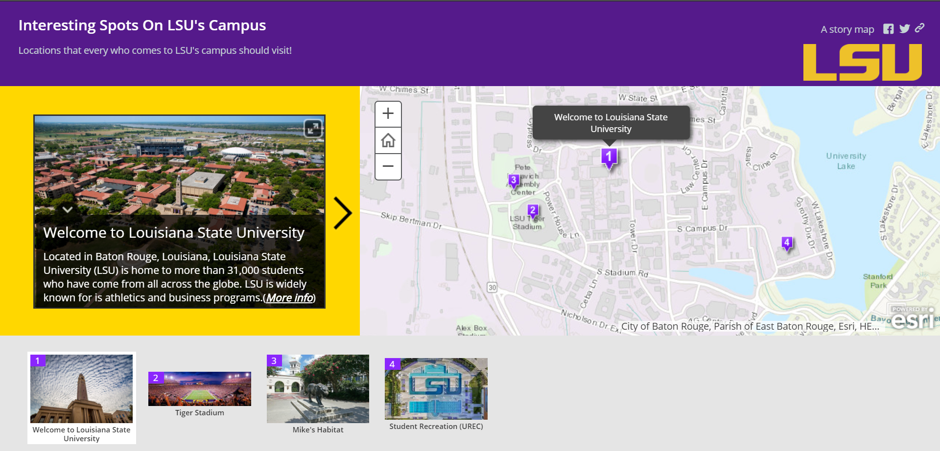
New to LSU's campus? Well this is the story map for you! Not only will it show you four of the most exciting places on campus, it will also tell you a little about each place. It starts you out at in the quad and ends at the newly renovated student urec center. On the way you will visit the world famous "Death Valley" and also have a one of a kind experience when you visit LSU's live, on campus mascot, Mike the Tiger.
Click Here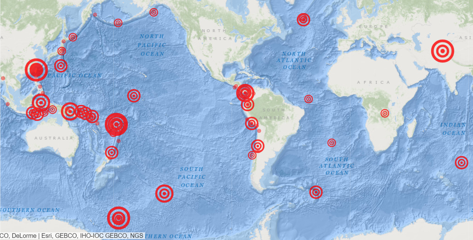
This is a map created by using ArcGIS that takes a look at earthquakes with a magnitude of 4.5 or higher that occured all across the globe within the last week. The neat thing about this map is that it updates un real time. The map refreshes every minute meaning that if the USGS records an earthquake of magnitude 4.5 or greater, then this map will reflect that earthquake. If you click on a target a pop up will appear with the USGS logo on it. If you click that you will be brought to that earthquake's specific event page.
Click Here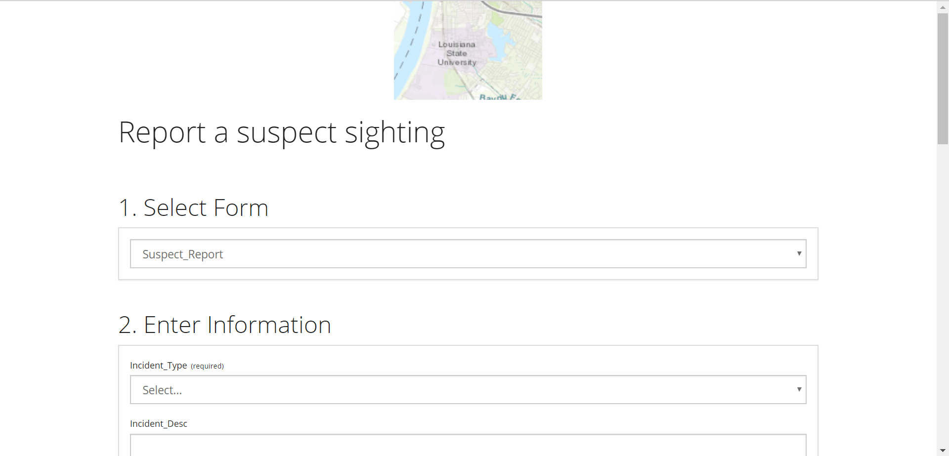
This map uses ArcGIS' feature layer to allow people to fill out a form online with information about a "suspect". This information, along with they place the spotted the "suspect", appears on a public map everyone can see. It is essentially using something like crowdsourcing to let others know that they saw a "suspect" around this location. This kind of map has many uses from locating suspects to letting your community know about things like potholes or downed power lines. The button will take you to the form citizens fill out for it to appear on the map.
Click Here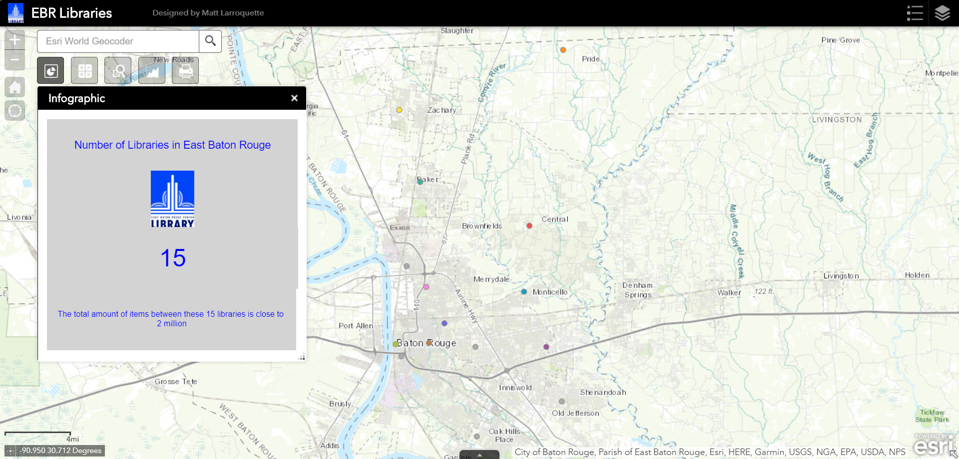
This map was built using ArcGIS' Web AppBuilder feature. It shows the 15 libraries that make up the East Baton Rouge Library system. Inside this map, the user has access to different kinds of widgets: infographic (which says the number of libraries in the system), query (which shows all the libraries in BR), summary (which counts the libraries), chart (which breaks down the libraries by city) and finally print. The button below brings you to the web app.
Click Here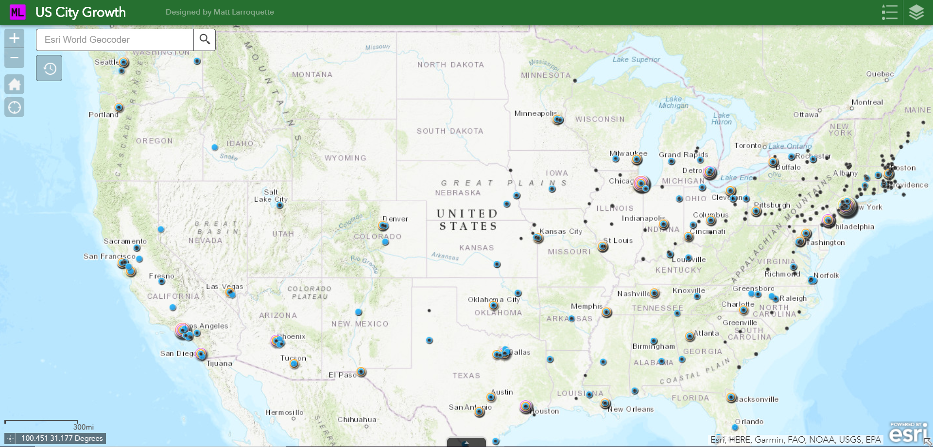
This map was built using ArcMap and ArcGIS' Web AppBuilder feature. It features an animated time slider that displays the growth of US Cities over time by population. Each population range is designated by a specific colored circle which can be found in the legend.
Click Here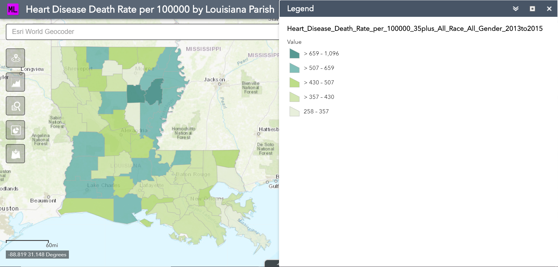
For my midterm project, I wanted to take a closer look at heart disease related deaths in louisiana. I gathered data from the cdc from 2013-2015 for one of my feature layers. I also used a dataset that had all the hospitals in Louisiana that I let users edit since the data is a little out of date considering it is from 2007. My last layer is about household incomes by parish. This gives the user a good look at the correlation between income and heart disease. After running an analysis on the map, it appears that the places with the highest rates of death by heart disease comes from places of lower income.
Click Here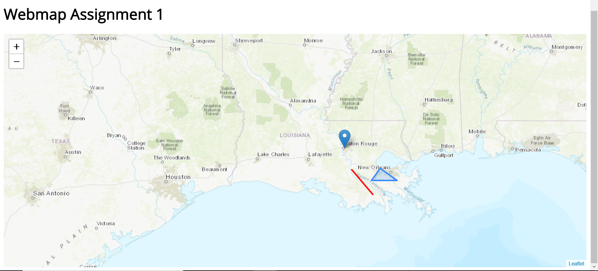
This map shows the basic things you can do with leaflet like adding a marker, polygon, or line.
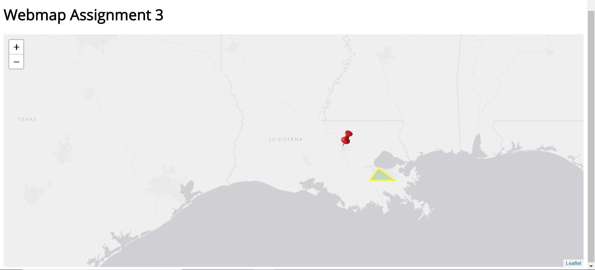
This map shows how we can edit the base map of a leaflet map and also that we can style the markers and lines on a map.
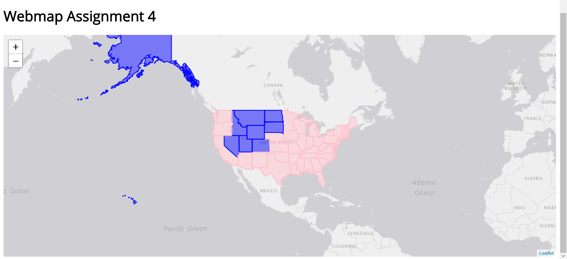
This assignment was all about taking geojson information about the United States (helped outline the us and gave us data to us for the map itself). We took information from the data we had and styled the map based on some attributes. I used the male and female categories given to calculate how much of the states population was male vs female and then I colored the states accordingly, blue for male population being over 50%, pink for female population for being over 50%.
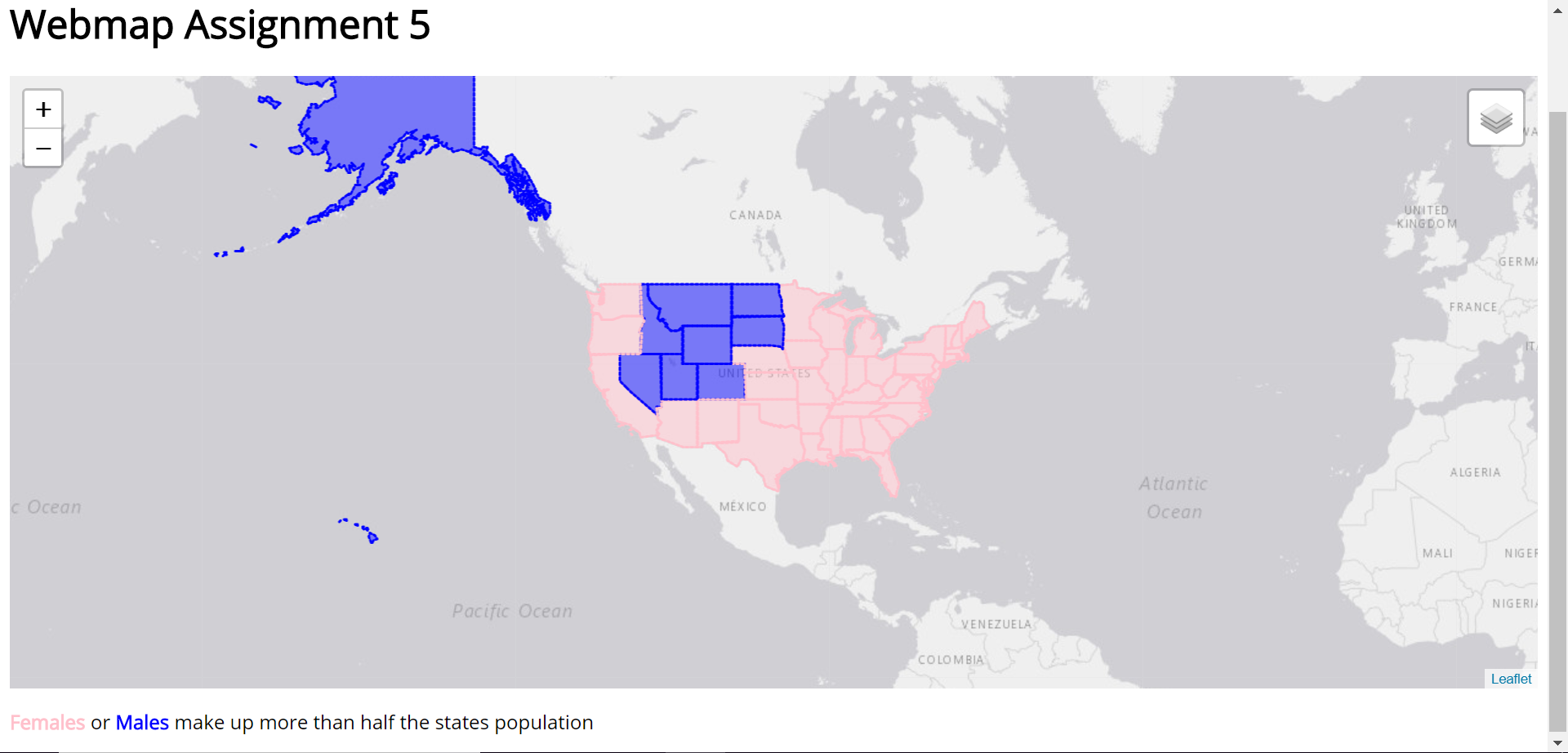
For this assignment, all we did was add the ability for the user to switch between basemaps, while keeping all of the information from webmap assignment 4 available. You can see the final result from working on all the webmap assignments by either clicking the button below or clicking the button under the portfolio entry for "Professional Athletes (All Time) by State"
Click Here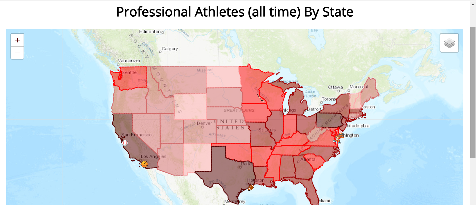
For my final project for this course, we were allowed to pick a topic of interest and create a map using the data we find from that topic with the help of Leaflet. I decided I wanted to look at how many professional athletes are produced by state. I gathered my data from sports-reference child sites Pro-Football Reference, Basketball Reference,Hockey Reference, and Baseball Reference. You can view the map in total by clicking the button below.
Click Here